Color Theory Monkey Business

As a graphic designer, one of my favorite parts of the job is playing around with color and seeing how different colors interact with one another. It can be quite shocking at times just how different colors will look against a variety of other colors. A very intense color theory class that I took in college taught me all the ins and outs of this while doing all those crazy Joseph Albers exercises. Fun!
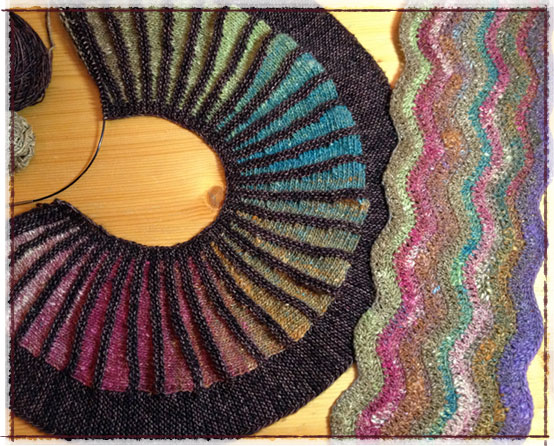
So now it’s great to see this working up in my knitting. No doubt, Joseph’s wife Anni Albers, a textile artist enjoyed this kind of fiber excitement too! I don’t normally do a lot of color work so I don’t really get to play with color combos that much when it comes to my knitting but I’m having a ton of fun with my Spectra Scarf watching how the Noro is working up next to this dark reddish brown color (the Kale colorway in Madelinetosh Merino Light) versus how it looked in the ripple scarf I crocheted a while back. The photo above shows the two photographed together and there is a very noticeable difference in how the Noro colors look. They seem so much more saturated surrounded by the darker color than on their own. Love it!